Wedding Decor Mistakes That Ruin the Photos
Beautiful decor can still photograph badly, so here are the decor mistakes that spoil wedding photos and how to choose decor that looks good on camera.
Decor is seen twice: by the guests, and by the camera
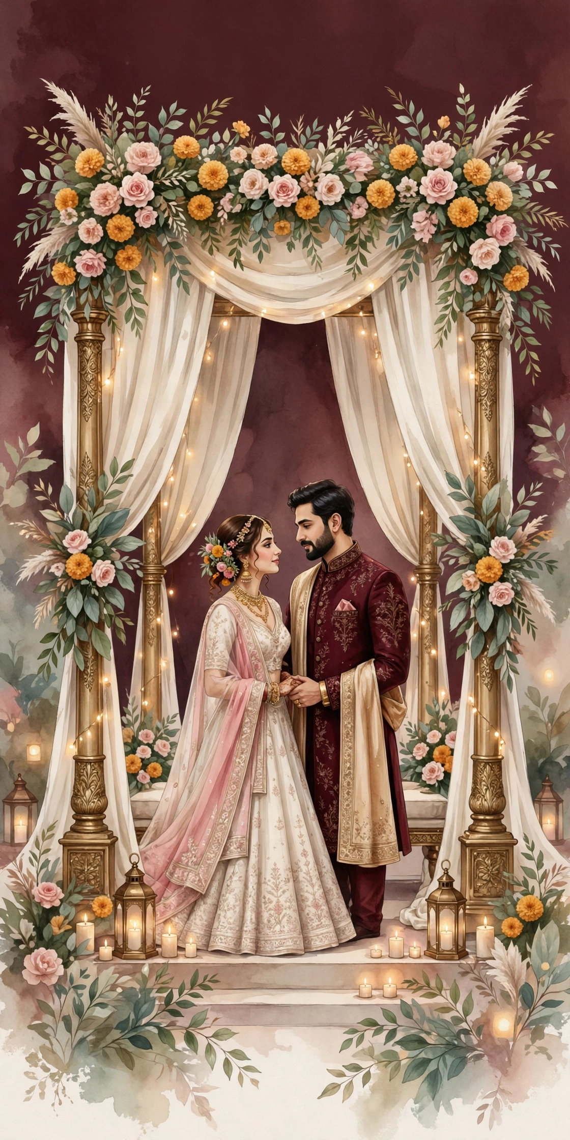
Wedding decor is judged twice. Once by the guests, who see it in person, and once by the camera, which sees it without mercy. A mandap that looks grand in person can look cluttered in a photograph. A colour that glows under the hall lights can turn harsh under the camera flash. The families who think about the photographs while choosing the decor get both: a wedding that looks beautiful, and photographs that prove it.
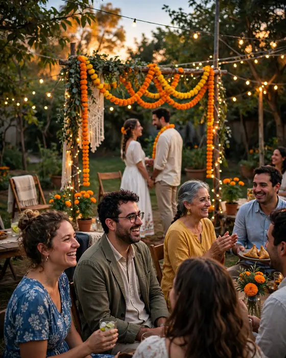
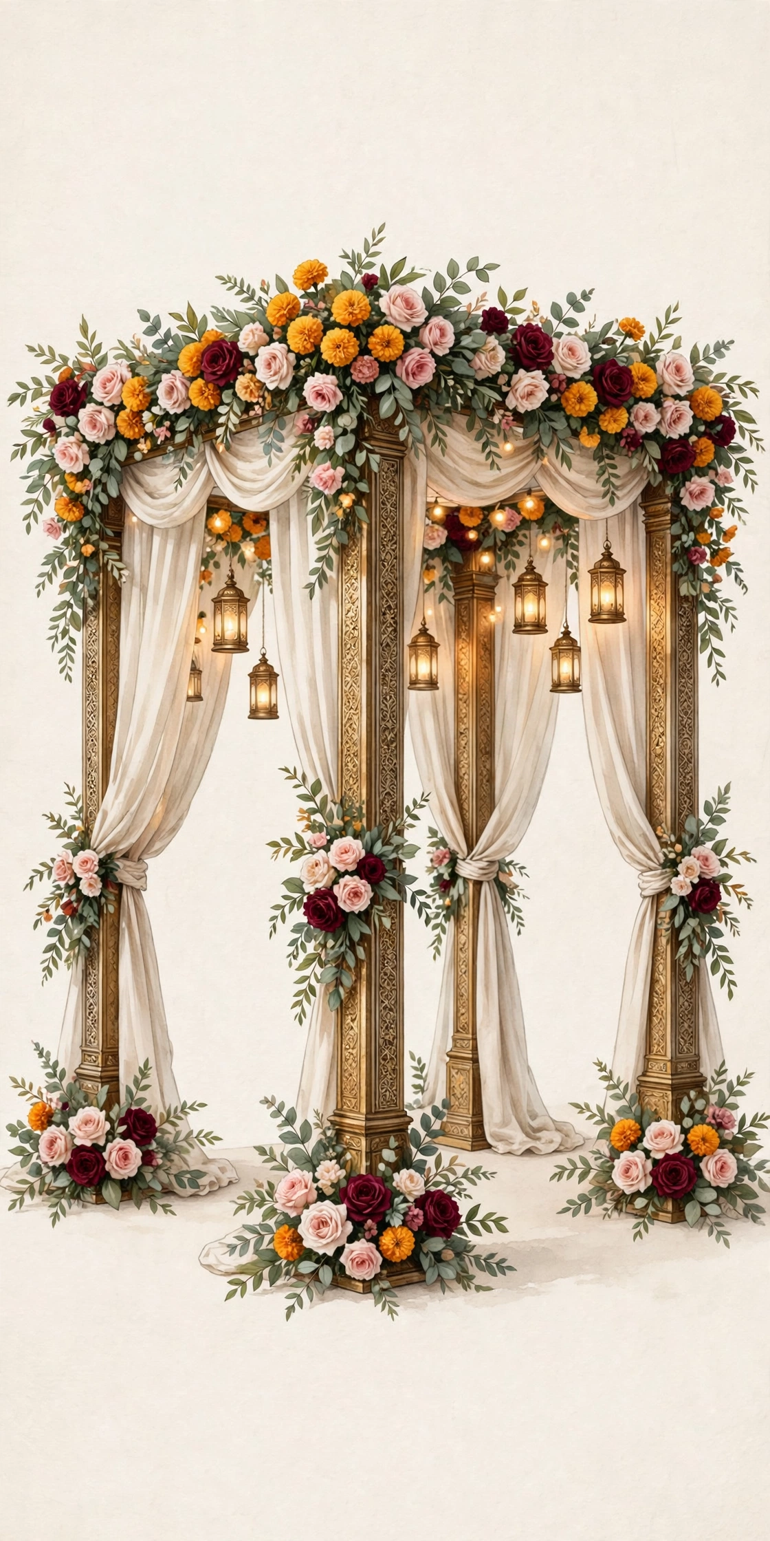
The most common mistake is choosing decor for the venue, not for the photographs. Dark drapes, busy patterns, and heavy floral walls all look rich in person, but they swallow light in a photograph, and the couple disappears into them. Light colours, clean lines, and one clear focal point photograph far better. The mandap should frame the couple, not compete with them. When the couple sits under it, the camera should find their faces first, and the decor second.
The second mistake is too much decor. Every surface covered, every pillar wrapped, every table crowded, and the eye has nowhere to rest. The photographs become a catalogue of objects, not a record of people. Choose one statement piece per function: the mandap for the ceremony, the stage for the reception, the entrance for the arrival. Let the rest be simple. Restraint photographs better than excess, every time.
Colour, light, and the camera
Colour is where most decor mistakes begin. Neon colours, mirror work that catches the flash, and glitter that scatters light all fight the camera. The photographs come out with hot spots, colour casts, and faces that look washed out. Choose colours that flatter skin: warm ivory, blush, maroon, gold, and sage. Test the colours under the actual lights of the venue, and ask the photographer which colours their camera handles well. A colour that looks good on a phone screen in daylight can look very different under yellow hall lights at night.
Light is the other half of the photograph. A venue with one bright light above the mandap and darkness everywhere else gives the camera a harsh contrast, and the guests in the dark disappear. Ask the decorator for even, warm lighting across the ceremony area, with extra light on the couple's faces. Avoid a single spotlight that creates deep shadows. And check the lighting at the same hour as the function, because the light that works at noon fails at dusk.
Talk to the photographer before finalising the decor, not after. Show them the decor plan, and ask what will photograph well and what will not. A good photographer will point out the flower wall that will block the family portraits, the drapes that will catch the wind and cover the couple, and the stage that is too high for the elders to climb. That one conversation saves the photographs, and it costs nothing.
Scale, clutter, and the background
Scale is easy to get wrong. A mandap built for a palace, placed in a small hall, leaves no room for the guests, and the photographs show a crowded room with no air in them. A stage built too high makes the couple look distant, and makes the elders climb steps they should not climb. A floral installation built too low blocks the view of the ceremony from the back rows. Measure the venue, and build the decor to fit it, not to fill a photograph someone else took in a different hall.
Clutter is the enemy of a good photograph. The water bottles on the mandap, the bags under the chairs, the wires across the floor, and the extra chairs stacked behind the stage all appear in the photographs, and they stay there forever. Ask the decorator to hide the wires, to keep a clear area behind the couple, and to remove the clutter before the ceremony begins. Ask the family to keep the mandap clear of bags and bottles. A clean background is the cheapest decor of all.
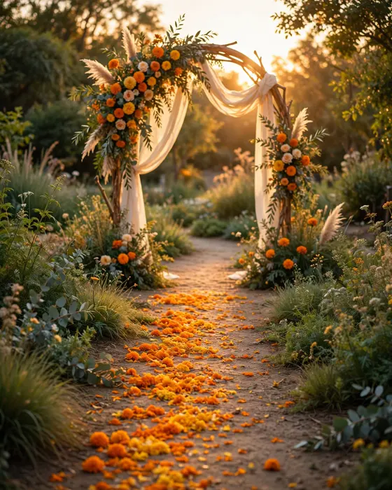
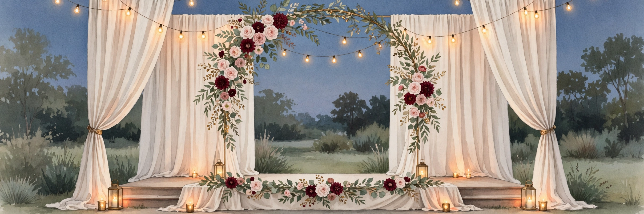
The background behind the couple deserves its own thought. The camera will see whatever is behind them: a fire exit, a kitchen door, a pile of chairs, or a beautiful floral wall. Choose the background deliberately, and keep it clear. A simple drape, a floral arch, or a garden view all work. A stack of chairs does not. Walk behind the mandap before the ceremony, and look at what the camera will see. That two minute check is worth more than any amount of decor.
What it costs
On MyIndiAura, a Cinematic Invite is ₹499, an Invite App is ₹399, and an Invitation Suite is ₹99. Choose by what your invitation needs to do, not by price alone. A cinematic invite suits a wedding with a film led opening, while an invite app suits a full week of functions with RSVP and maps.
How to create your wedding invitation
- Pick a design from the designs page at myindiaura.com/designs.
- Add the names, the venue, the order of events, and the RSVP button.
- Add photos of the couple, the venue map, and the travel guidance for outstation guests.
- Preview the invitation on your own phone, then share the link on WhatsApp. See myindiaura.com/create to start, and myindiaura.com/pricing for the full price list.
Details to check before you send
- One statement piece per function, with the rest of the decor kept simple
- The colours tested under the venue lights, with the photographer asked first
- Even, warm lighting across the ceremony area, with light on the couple's faces
- The decor measured to fit the venue, with room for guests and for the camera
- The wires hidden, the clutter removed, and the background behind the couple checked
- The photographer shown the decor plan before it is finalised
Frequently asked questions
What decor colours photograph best at weddings?
Warm ivory, blush, maroon, gold, and sage, because they flatter skin and hold their colour under hall lights. Avoid neon colours, mirror work that catches the flash, and heavy glitter, which create hot spots and colour casts in the photographs.
Should we ask the photographer about the decor?
Yes, before finalising it. Show them the decor plan and ask what will photograph well. A good photographer will spot the flower wall that blocks the family portraits, the drapes that cover the couple, and the stage that is too high for the elders.
Is more decor always better for photos?
No. Too much decor leaves the eye nowhere to rest, and the photographs become a catalogue of objects instead of a record of people. One statement piece per function, with the rest kept simple, photographs far better than excess everywhere.
How do we keep the background clean in photos?
Choose the background behind the couple deliberately, hide the wires, and remove the clutter before the ceremony begins. Walk behind the mandap before the function, and look at what the camera will see. A clean background is the cheapest decor of all.
MyIndiAura theme showcase
These Cinematic Invites from MyIndiAura fit this wedding. Each one is ₹499.
- Peony Bloom: a soft floral opening for a beautiful celebration.
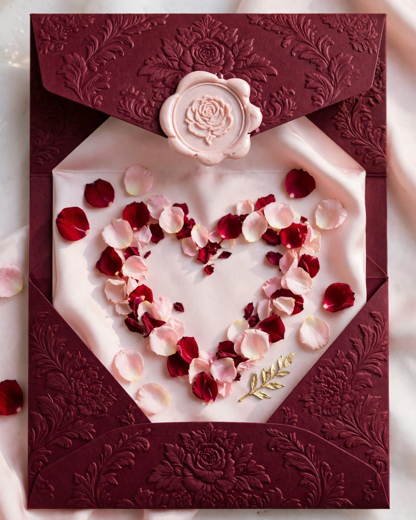
- Gulab Dil: a rose filled opening that suits a classic family wedding.
- Gulaabi Aangan: a pink courtyard welcome for a big family gathering.
Related reading
- How to Coordinate Wedding Invitations with Wedding Decor
- Trending Wedding Decor Ideas for 2027
- Wedding Reception Invitation Wording and Examples
Frame the couple, not the decor, and the photos will shine.
Explore invitation designs
Choose a design and preview it free with your own names.

Found this useful? Share it with someone planning a celebration.
Share